

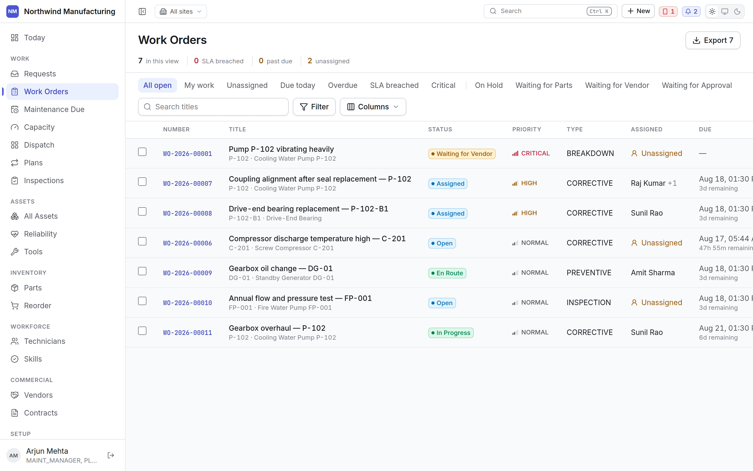
The sidebar
Screens are grouped by what you are doing, not by which table they read.
Root Cause sits directly under Reliability because that is where an investigation starts — a
recommendation saying this has failed seven times is what opens one. Sensors sits with the
machines because a sensor is an attribute of an asset, not a monitoring department.
You only see what your roles permit. A technician’s sidebar is much shorter than an
administrator’s — this is not a fault, it is access control working.
- Full sidebar — the default on a desktop.
- Icon rail — click the panel button beside the organisation name to collapse it and get the width back. Your choice is remembered.
- Drawer — on narrower screens the sidebar becomes a slide-over you open with the menu button, because a permanent sidebar would eat half a tablet.
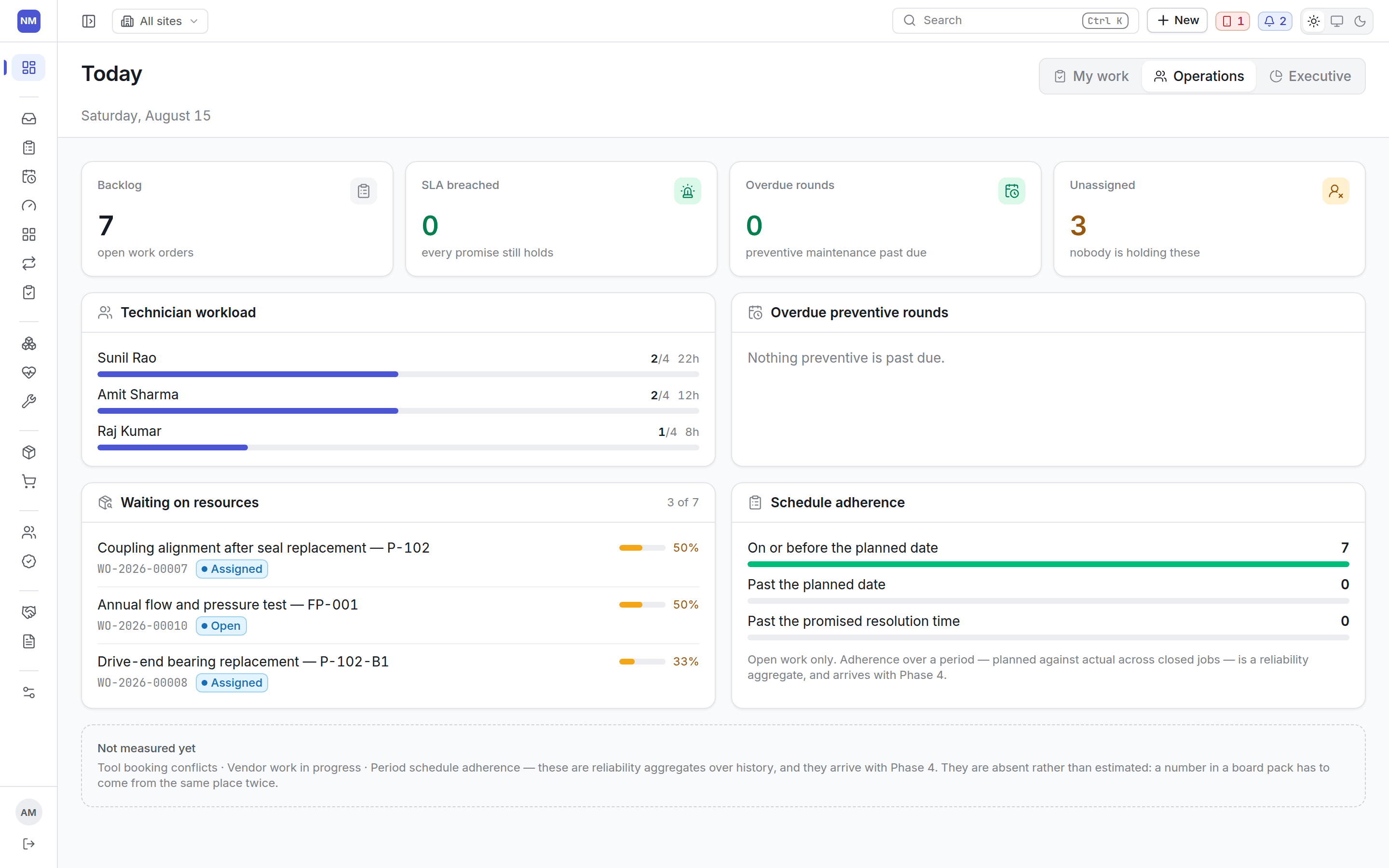
The header
Site switcher
Site switcher
Opens onto your organisation’s own tree — company, business unit, sub-unit, down to individual
sites — each with a checkbox. Tick one site, or tick a whole branch and take everything under
it at once: a region, not a location, is a perfectly normal thing to filter to. Find a site
or a region searches the tree directly, which matters once it has more levels than you want
to expand by hand. Apply commits the selection.A banner stays up while a filter is active and names what it is showing — Showing West Region
only, say — with a Clear to widen back to everything. Dispatch, Capacity and Reliability
read the same selection now: pick a region once and it narrows all three, where each used to
take only a single site.Still a view filter, not a permission — it cannot show you a site your account may not reach.
Search and Scan
Search and Scan
Search finds anything you could open: assets, work orders, requests, parts, technicians,
vendors, contracts. Results carry the record type, its number, its status and where it is, so
you can tell two similarly named pumps apart before clicking.Scan sits beside it in the same tray now — point it at a barcode or QR code and land straight
on the asset or part behind it. It used to be its own screen under Assets; scanning something
is closer to searching for it than to browsing a list, so it moved.
Command palette
Command palette
Ctrl+K, or ⌘+K on a Mac. Jump to any screen or record
by typing. Faster than the sidebar once you know where you are going.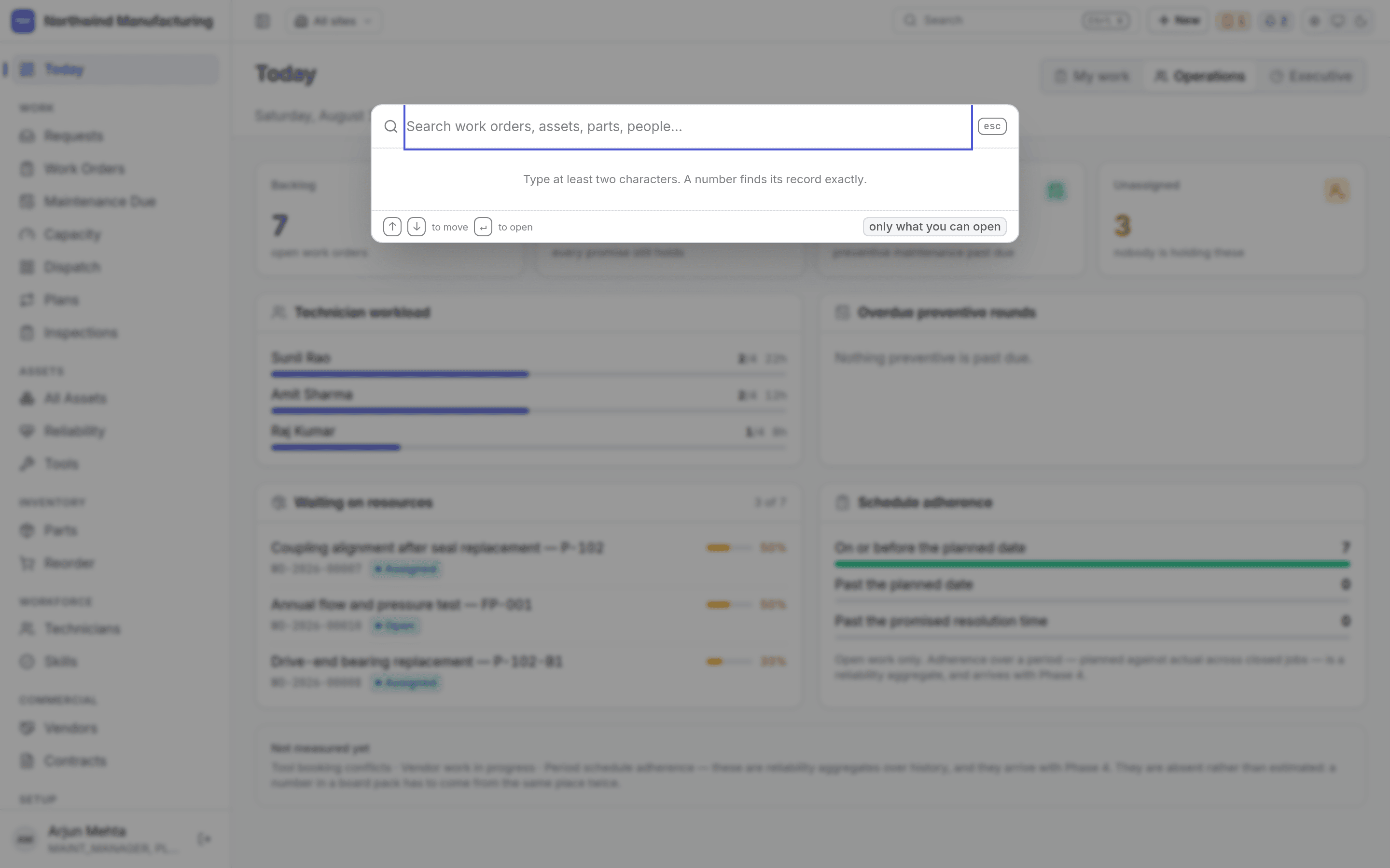
New
New
Creates a record from wherever you are — an asset, tool, work request, purchase request, part,
vendor, contract, technician, found item and more — without navigating to its screen first, and
every one of those opens as a pop-up: a centred card on a desktop, a full-width sheet from the
bottom on a phone. The page underneath stays where it was.Work Order and Maintenance Plan are the exceptions — both take you to their own multi-step
screen instead, because filling one in is a stateful flow with its own tabs and progression,
not a form you fill in and dismiss.
Approvals
Approvals
A stamp icon, grouped with Notifications and the Sync tray into one visually distinct cluster —
each of the three carries its own live count. Clicking it previews what is waiting on you and
links through to the Approvals screen for the rest.That screen has two tabs, Waiting on you and You asked for, with Approve and Reject
actions — rejecting requires a typed reason, so nothing gets turned down in silence. Stats at
the top count what is waiting on you, what is overdue, and how many requests of your own are
still open.It used to be a sidebar item under Work. Approving something is a thing you do in passing on
your way somewhere else, not a screen you plan a visit to, so it moved to the header.
Notifications
Notifications
The bell carries a count of what you have not read: a service level at risk or breached, a
contract or certification expiring, a tool due for calibration, a comment on something you are
on. Reading one takes the count down.What you are subscribed to is configurable.
Sync tray
Sync tray
Beside the bell, and only interesting when it is not. It shows whether anything from the
handsets is stuck — a collision waiting on a decision, or an operation that failed. Nobody opens
a navigation item to find out whether something is broken, so it lives in the header.Opens the Sync Center.
Theme
Theme
Light, system or dark. Your choice, stored in your browser.
Lists
Every list screen works the same way.- Views along the top — the fixed ones plus a chip for each of your organisation’s own statuses and types. A plant that added a fourth on-hold state gets a fourth chip.
- Search filters by title or number.
- Filter narrows by any column, and each column brings the operator that suits its data rather than one generic match. Text columns get contains, starts with, ends with, is exactly, does not contain, is blank, is not blank. Number columns get between, equals, at least, at most, is blank, is not blank. Choice columns get is any of / is none of, with a multi-pick list. Date columns get named windows instead of a calendar to fiddle with — today, yesterday, tomorrow, this week, last week, this month, last month, this quarter, this year, last 7/30/90 days, next 7/30 days, before now, after now, not set, set — worked out against your own timezone, not the server’s.
- Columns chooses what is shown, and what the list is holding back. Your layout is remembered per list.
- Order is yours too: drag a column heading sideways to move it, or drag it up and down in the Columns menu, which is how you reach a column that is off the right-hand edge. The grip in that menu also takes the arrow keys, so the arrangement can be made without a mouse. Back to the screen’s own columns undoes the lot.
- Export is a button, not an afterthought, and it is on every list now — not just Work Orders, and no longer a raw capped dump. It honours the current filter and sort, writes readable column labels instead of field codes, formats dates and turns booleans into Yes/No, and offers visible columns or every column, each showing you the count before you commit. It pages through everything that matches rather than truncating quietly, shows an Exporting… state while it works, and refuses outright past 100,000 rows — past that, it points you at a saved report instead.
Detail screens
A record opens on its own screen with tabs across the top. The tab strip carries counts, so you can see there are four open failures without opening the tab. Actions live in a bar at the top and come from your organisation’s own state model. If you expected a button and it is not there, your configuration does not allow that move from the state the record is in — see statuses and transitions.Nearly every create and edit form, in records and in Settings alike, opens as the same pop-up
dialog described under New — not an inline panel pushing the page down underneath it. And
wherever a form asks you to pick another kind of record — a category, a site, a vendor — a small
+ beside that field opens a mini create-form for it on the spot. Save it, and it is selected
in the parent form automatically; you never lose your place to go create something you realise
you need halfway through.